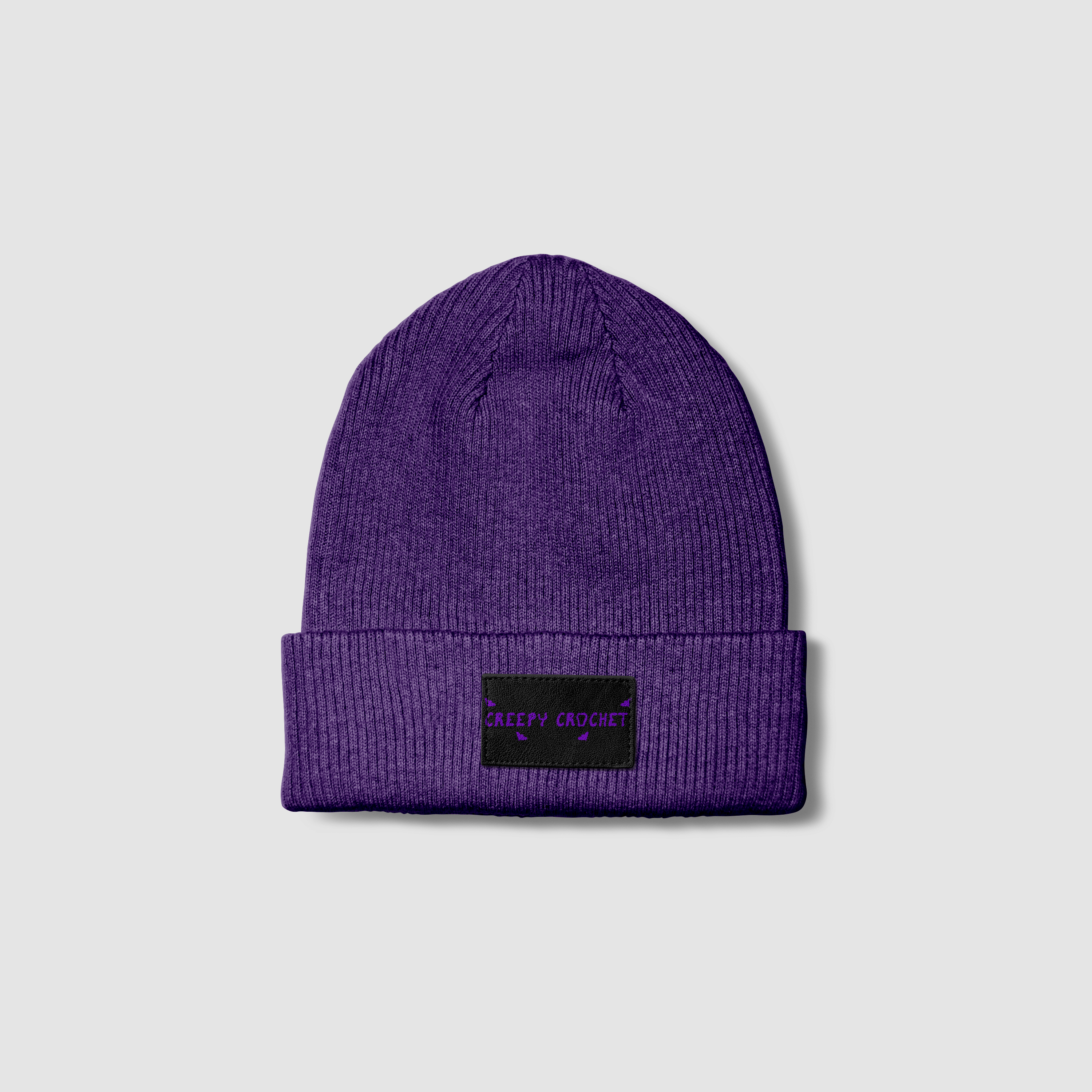
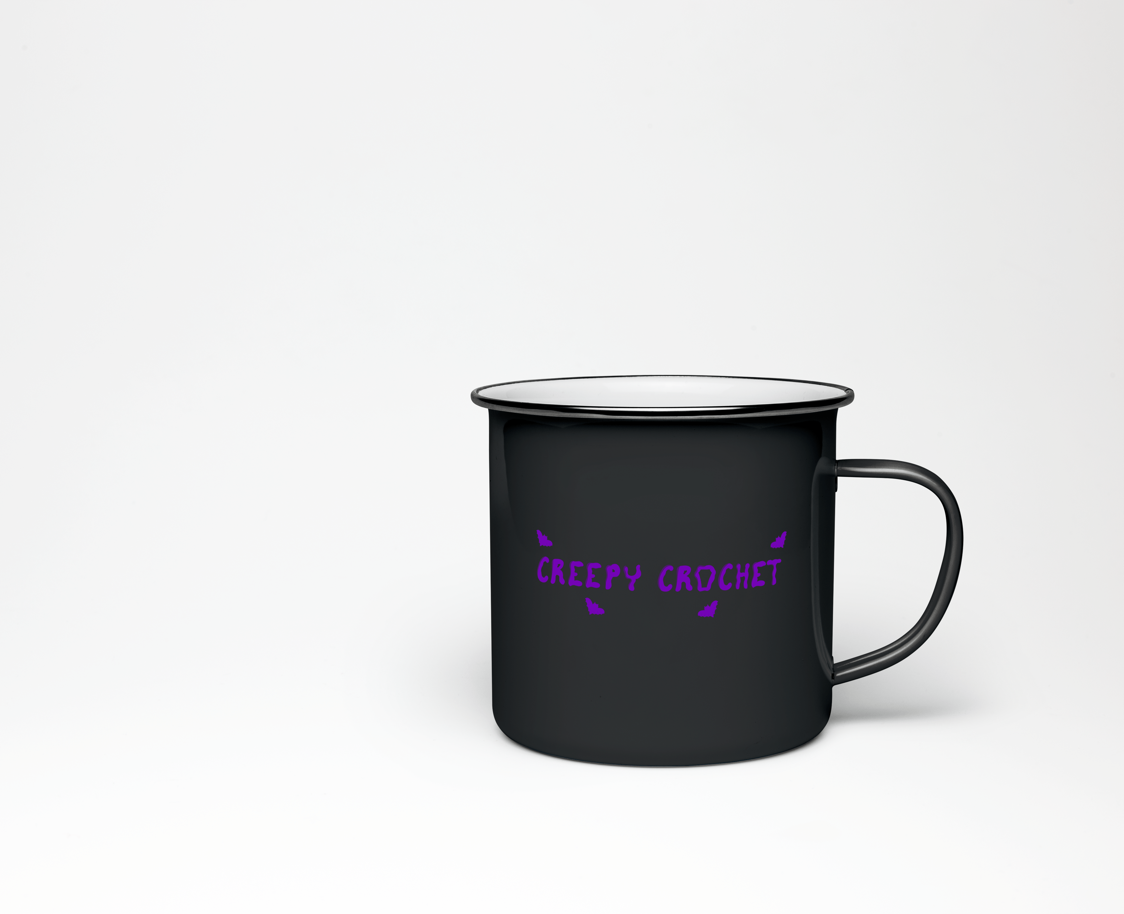
Creepy Crochet
The client wanted a spooky-esque logo for their crochet
business.
The client is a horror fan and makes a variety of spooky
products. The products are more cutesy-scary than gore and
horror, and they wanted the logo to represent that.
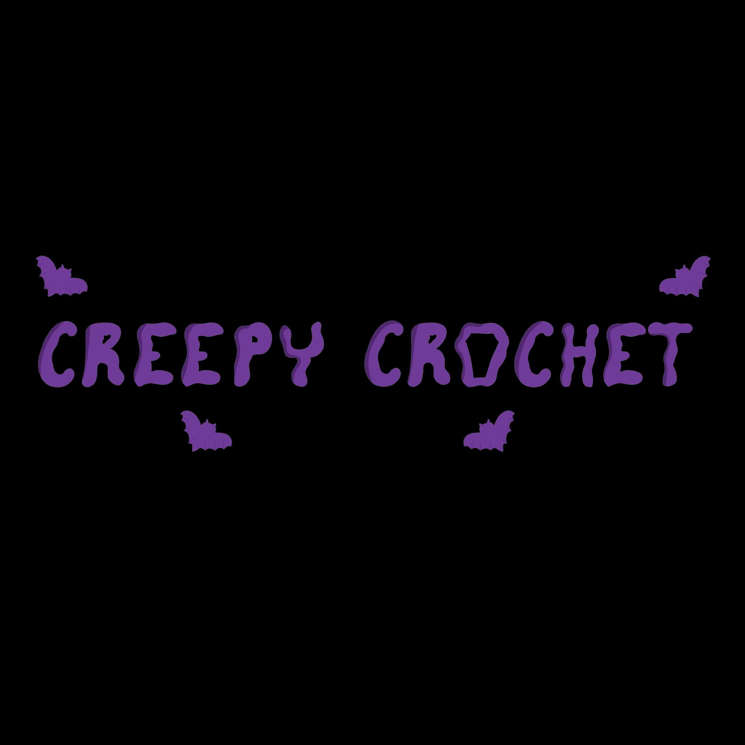
The type was hand drawn and rendered. It is a
friendlier spooky font, with bubbly “getting chills” font. The
'O' in crochet is shaped as a coffin to emphasize the theme.
The client also asked for bats, because bats are
their favorite animal and continue to fit the spooky theme.
As for colors, the client loves and wanted purple. Also with the
platform they were looking to use to sell, the two tone purple
was influenced by it.


